 The Setup
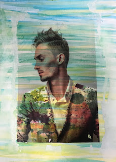
To begin this printing assignment, I chose two of my previous works from my Behance profile and sized them accordingly to both fit a standard sheet of printer paper at 6"x4" each. I kept one in it's original color, adjusted the other to be black and white, and then printed them out. Then, I set them aside for a day or two and experimented with water color. Since we were allowed the freedom to design whatever we wanted, I decided to chose different color arangements for each. On one I painted yellow, green, and blue stripes and on the other I used a red and purple splatter technique. Once our paintings dried, we began the actual printing process.
Day 1
On the first day of the printing process, we began by cutting out both photos out leaving a 1/2-1 inch border. From there, we applied mod podge to the areas of the photo with ink on it and placed it face down onto the watercolor (inked side face down against watercolor). Then, we used a squeegee. A squeegee is a great tool because by applying smooth, light pressure to our print, I can eliminate any possible bubbles and get rid of excess mod lodge. Once I was satisfied with the smoothing, I left them to dry over night.
Day 2
 When everything was dry, I used a small amount of water and wet my image to begin peeling away the printer paper. By using my fingertips to rub away at the paper, everything was removed except the ink which was left behind on the watercolor. By using this technique, I had to be especially careful to apply enough pressure to peel the paper, but at the same time not press too hard as to remove the ink as well. What I found most difficult about this process was not messing up the watercoloring underneath. Although my print itself was revealed successfully, my painting got kind of smudged in the process.
 What Was the Takeaway?
This project definitely turned out differently than how I expected. It was fun to use watercolors again in a more complex way and it was neat to see the difference between the print in color and the print in black and white. Since the watercolor shows through there there is no ink present, I expected the black and white to turn out better however, I found I was more impressed with my colorful landscape man. Overall, this was a different take on a graphic design project and I enjoyed the change of pace.
Comments
Post a Comment